The Power of Motion: Leveraging Animated Data Stories and Visualizations
- Bernard Kilonzo
- Mar 29
- 3 min read

What are Animated Visualizations?
Animated visualizations are a dynamic way to present data, concepts, or stories by combining visuals with motion over time. Unlike static visualizations, like charts or graphs, animated visualizations use movement to illustrate changes, relationships, or processes in a more engaging and interactive way.
For example:
Data Trends Over Time: Showing how populations grow or climate changes over years with moving graphs.
Storytelling with Data: Bringing to life a narrative, like how a virus spreads geographically.
These visualizations are widely used in education, media, business, and scientific research to make complex ideas easier to understand. They’re also popular in presentations or on social media to captivate an audience.
Why Animation Matters in Data Storytelling
Animations are crucial in data storytelling because they elevate the way we understand and engage with information.
Here are some of the reasons you should use animations in your presentations more often.
Enhancing clarity: Animations can break down complex data or processes into bite-sized, easy-to-follow sequences. They make abstract concepts more tangible, which is especially helpful when explaining intricate patterns or relationships.
Capturing attention: Motion naturally draws the eye. Animated elements keep the audience engaged and focused on key points of the story, especially in presentations or online platforms.
Showing change over time: Data often evolves, whether it's trends, growth, or movement. Animations illustrate these changes visually, allowing viewers to see the narrative unfold dynamically.
Improving retention: People tend to remember visuals better than text alone, and adding motion further increases retention. Animation combines storytelling with sensory stimulation, making the message stick.
Encouraging emotional connection: A well-crafted animated visualization can evoke emotions or create a personal connection to the data. It turns numbers and statistics into relatable stories that resonate with the audience.
Demonstrating cause-and-effect: Animations can show how one action leads to another, making the relationships between data points clearer and highlighting important insights.
Making data stories accessible: For audiences less comfortable with charts or graphs, animations simplify the data and make it approachable and inclusive.
Examples of Animated Visualizations
Here we’ve put together some examples of animated visualizations to demonstrate how animations help users understand and engage better with information.
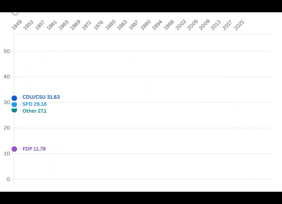
Racing bar chart

Racing line chart

Animated scatter plot

Animated point map

Tools for Creating Animated Data Visualizations
Several tools make it easier to incorporate motion into your data storytelling, they include.
Tableau: Offers animated dashboards that highlight transitions and trends over time.
Power BI: Provides features for creating dynamic visuals and interactive storytelling.
D3.js: A JavaScript library for building custom animations tailored to your specific data needs.
Flourish: A user-friendly platform with templates for animating charts, maps, and more.
R (gganimate): Extends R’s ggplot2 library to include animation capabilities, perfect for statistical and academic visuals.
Each tool has its strengths, and the choice depends on factors like your technical expertise, the complexity of the visualization, and your storytelling goals.
Conclusion
Animated data visualizations are a powerful tool for transforming complex information into engaging, accessible, and memorable stories. By combining motion with visual representation, they allow audiences to grasp data trends, relationships, and changes over time with greater clarity and impact. From education to business, science to entertainment, their applications are vast and transformative. Animation not only captures attention but also fosters emotional connections and improves retention, making it an essential method for effective communication in the modern world. Embracing this dynamic approach empowers us to tell meaningful stories that inspire understanding and action.
If you like the work we do and would like to work with us, drop us an email on our contacts page and we’ll reach out!
Thank you for reading!
